8 Structural biologists, let’s mind our colors
Adapted from Shyam M Saladi, Ailiena O Maggiolo, Kate Radford, William M Clemons Jr. 2020. Structural Biologists, Let’s Mind Our Colors (preprint). bioRxiv Biochemistry. doi:10.1101/2020.09.22.308593
8.1 Abstract
Visual representations of macromolecules are used communicate the results of structural biology dependent on conventional color schemes that represent important numerical data. Commonly used color schemes are non-intuitive, limited in accessibility, and inadequately connect perception to the data. To address these issues, we present a case for optimizing color usage towards accurate interpretation by a broad audience. We provide simple tools that integrate with widely used graphical rendering programs, and enable seamless incorporation of perceptually uniform colormaps. Use of optimized and accessible color schemes, across biology, fosters clearer communication and deeper comprehension.
Keywords: data visualization, accessibility, perceptual uniformity, visual artefact, colormap, color palette, color-coding, color vision deficiency, macromolecular structure
8.2 Impact Statement
Useful figures require that colors are true to the data and accessible to readers with different modes of color vision.
8.3 Main Text
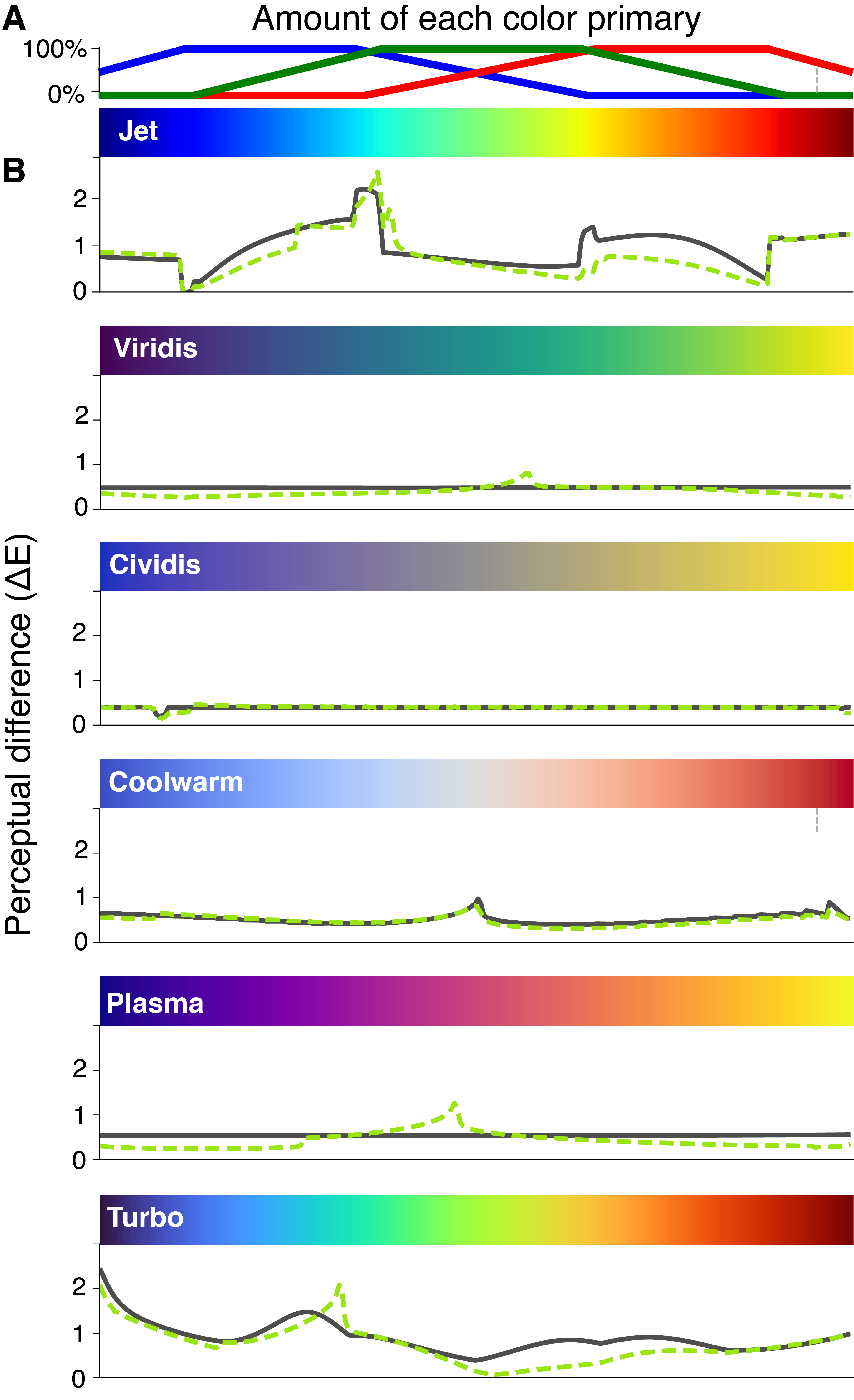
To visualize quantitative data, we often rely on colormaps to convert numerical data into colors. Ideally, a colormap faithfully reproduces variation in the numerical data as perceived variation in color. However, the most widely used rainbow colormaps introduce visual artefacts (Borland and Taylor, 2007; Moreland, 2016) that lead to errors in interpretation (Borkin et al., 2011). The most frequently used rainbow colormap, “Jet”, is formulated as a piecewise linear function of primary colors, i.e., red, green, and blue, and combined sequentially to form the rainbow (Figure 8.1A). These commonly used rainbow types of colormaps are problematic in two important ways. First, our brain perceives the variation across the color spectrum non-uniformly, leading to distorted interpretations and potential misrepresentations of the data in certain regions of the colormap. This non-uniformity can be quantified by calculating the perceptual difference (\(\Delta\)E) as the numerical distance between two colors on a colormap that can be differentiated (Moroney et al., 2002). The rainbow colormap Jet exhibits a jagged, irregular trace in the calculated perceptual difference for those with full-color vision (Figure 8.1B, solid black line). Notably, the cyan and yellow regions are perceived in a disproportionately pronounced manner, creating an exaggerated sense of contrast that does not faithfully mirror the changes in the numerical data. Second, the irregularity in the perceptual difference becomes more pronounced for the 4-5% of the population with different modes of color vision (red-green and blue-green color blindness) (Figure 8.1B, dotted green line).
Perceptually uniform colormaps present a clear solution by ensuring that the visually perceived differences align with the underlying numerical variations in the data (Kovesi, 2015). Many such colormaps have been designed to minimize the perceptual differences throughout the colormap, leading to smooth transitions in colors under various modes of color vision impairment (Nuñez et al., 2018; Smith and van der Walt, 2015). However, these improved colormaps, such as Viridis, Cividis, Coolwarm, Plasma, and Turbo (Figure 8.1B) are seldom used in structural analyses. To motivate broad adoption among structural biologists, we have developed tools (plugins) for popular visualization software platforms including Pymol, ChimeraX, and VMD which incorporate these improved colormaps. Furthermore, the underlying code is available on GitHub, enabling developers of these and other applications to integrate these colormaps within their respective codebases.

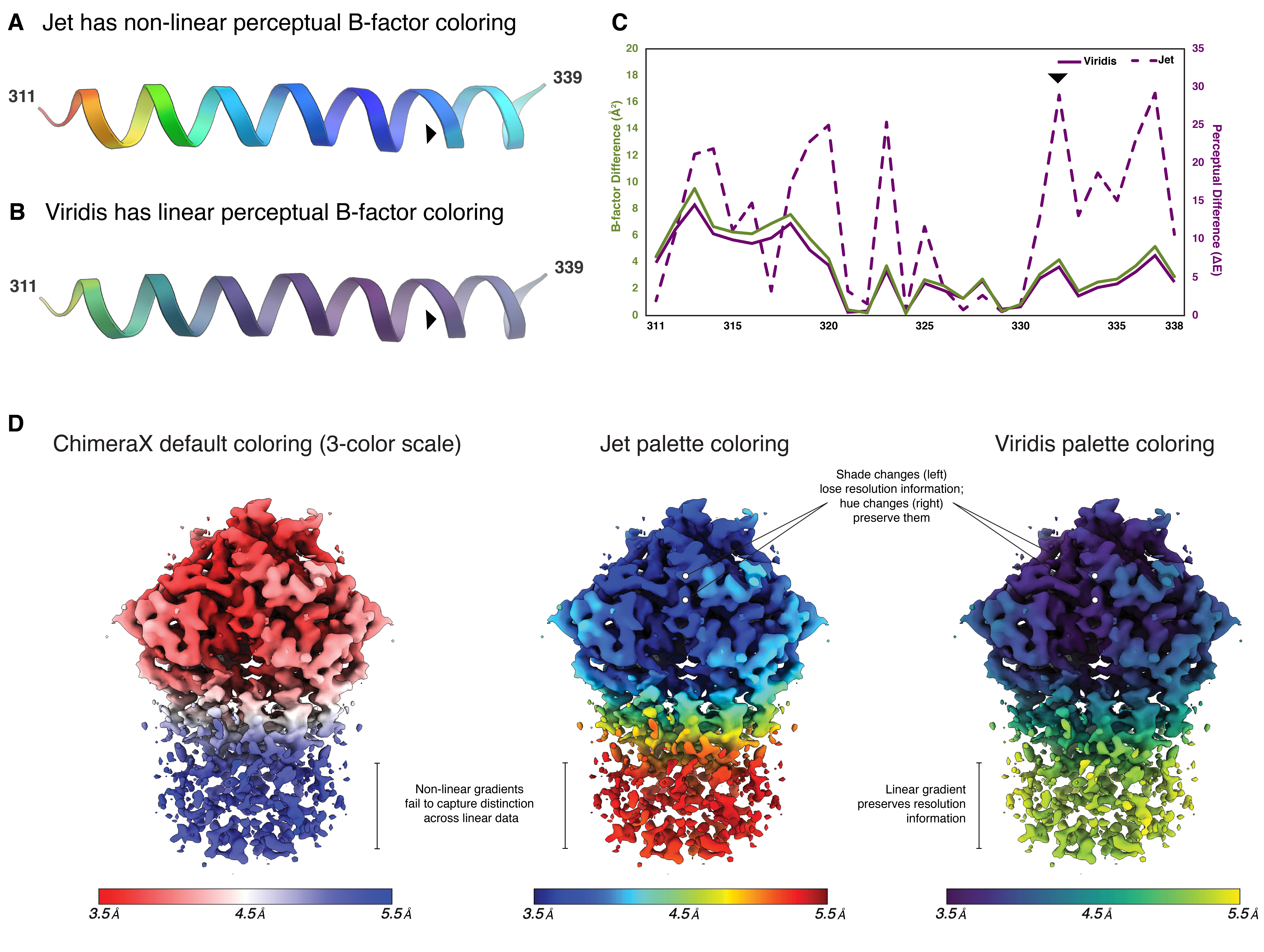
The improved structural interpretation offered by using a perceptually uniform colormap, such as Viridis, in lieu of Jet is evident through the widely adopted practice of coloring structures based on their atomic B-factors. B-factors are often used as indicators of regions in a crystal structure that adopt multiple conformations. Visual representation of these values can have significant impact on on how a structure is interpreted. To illustrate this, consider the \(\alpha\)-helix spanning residues 311 to 339 within the SecY translocon structure (PDB 1RH5, (Van den Berg et al., 2004)), depicted in cartoon representation and colored based on B-factors (Figure 8.2A,B). Using the Jet colormap creates an illusion of abrupt B-factor transitions that overemphasizes slight variability across the helix (Figure 8.2A). In contrast, using the Viridis colormap shows that such drastic B-factor transitions do not exist, portraying the accurate representation of the B-factor values (Figure 8.2B). By comparing the differences between the numerical B-factors of each residue and the perceived values from each colormap, we can identify areas where the Jet colormap is not faithful to the underlying data (Figure 8.2C, dashed purple line). For example, the arrows on each helix (Figure 8.2A,B) highlight one area that appears to have a drastic color change when using Jet coloring, but lacks significance in the actual B-factor data (Figure 8.2C, arrow). However, this transition is faithfully represented using Viridis (Figure 8.1C).
Using a perceptually uniform colormap to display local resolution maps is especially important for single particle cryo-electron microscopy. Figure 8.1D shows three representations of local resolution for the electron density of Get3 (EMDB 25373, (Fry et al., 2022)). By default, the Surface Color module in ChimeraX provides a red-white-blue divergent color map. However, the hues quickly deviate from white, giving the impression that resolution values cluster primarily around the extreme ends of the scale, rather than being uniformly distributed across all values. While Jet, which is the default colormap for displaying resolution in CryoSPARC, is an improvement, the lack of perceptual uniformity masks true variation in resolution. Shadows used to show the three-dimensionality of the density compete with the color gradient, particularly for the higher resolution data (in blue). Viridis is both perceptually uniform and consistently uses hues in addition to shades to distinguish colors, making it much easier for the viewer to correctly match color to resolution.

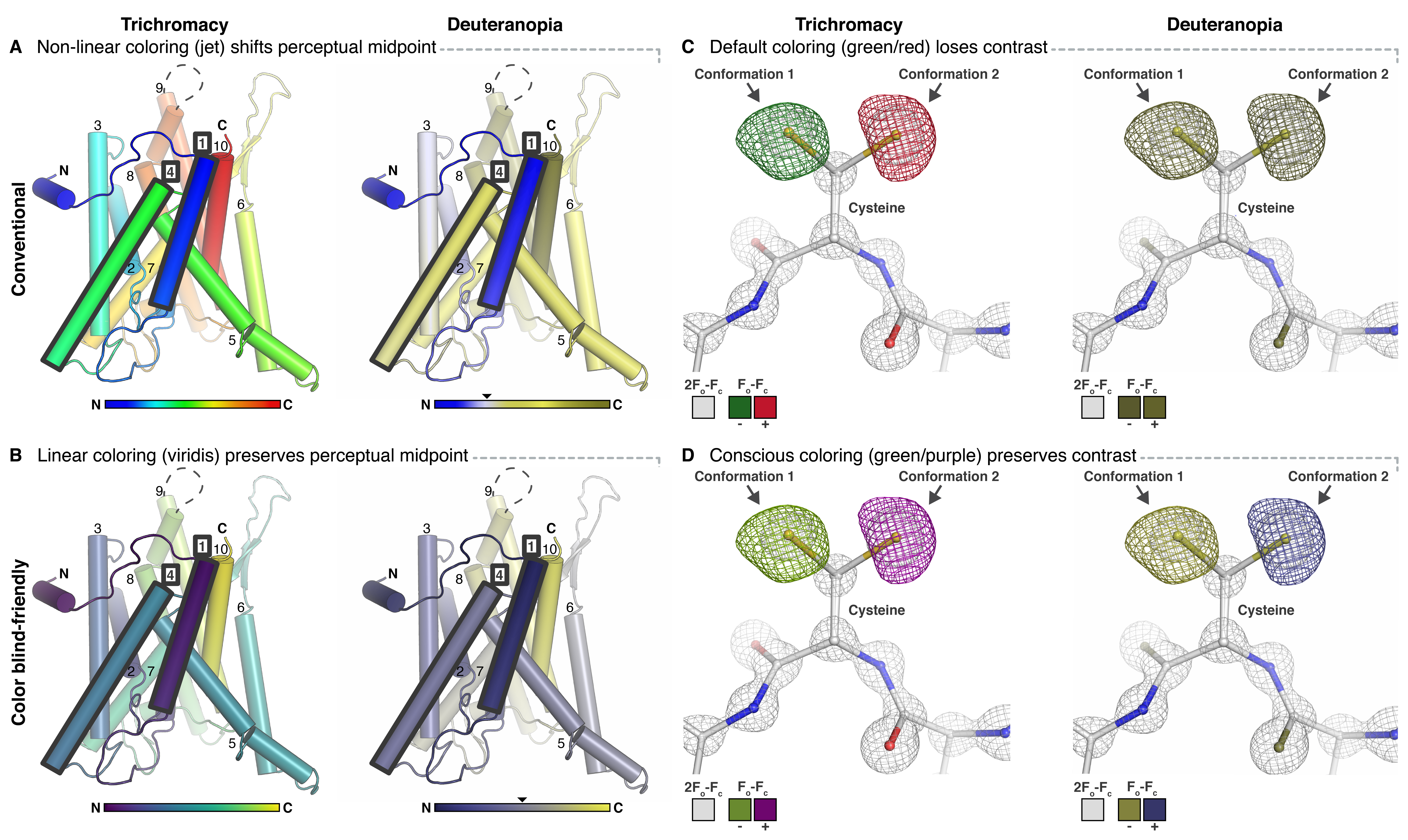
Colormaps that are non-perceptually uniform, heavily reliant on reds and greens, and lack consistent hue can pose significant challenges for individuals with color vision impairments, such as deuteranopia. To illustrate this point, we present an example using the SecY translocon, displayed with the standard N-to-C terminal Jet coloring scheme (PDB 1RH5, (Van den Berg et al., 2004)) both under normal color vision conditions (Figure 8.3A, left) and with a filter applied to simulate deuteranopia (Figure 8.3A, right). Under deuteranopia conditions, helices 1 and 4 wrongly appear to be located at opposite termini, and the perceptual midpoint of the color scale is significantly shifted off-center (Figure 8.3A, right). In contrast, using Viridis accurately maintains N-to-C terminal position of helices 1 and 4 by preserving the perceptual midpoint while under deuteranopia conditions (Figure 8.3B).
In another example, the common practice of displaying difference density maps (e.g., Fo-Fc n X-ray crystallography). In crystallography, electron density maps are typically represented as red (for negative difference density) and green (for positive difference density) presents accessibility challenges for individuals with color blindness. These difference maps, which compare experimentally observed electron density with the density calculated from an atomic model, are used to indicate areas where the model does not accurately represent the crystallographic data. Being able to differentiate these red and green density maps is essential for interpretating crystallographic data, which can put those with red-green color vision deficiencies at a disadvantage. For instance, a reside that adopts two conformations in differing occupancies could have positive difference density (typically shown as a green mesh map) for the higher occupancy conformation and negative difference density (typically shown as a red mesh map) for the lower occupancy conformation, especially if the occupancies are not refined (Figure 8.3C). These red and green maps are difficult to differentiate for those with deuteranopia (Figure 8.3D). Moreover, since legends are rarely included in macromolecular figures, readers less familiar with structure analysis cannot easily relate the different colored maps to their meanings. Moving to a different scheme, such as green/purple or blue/yellow, and including a key solves both issues (Figure 8.3CD). Beautiful and color blind-friendly palettes are easy to create for cases where discrete colors are needed (e.g., Okabe and Ito (2002)).

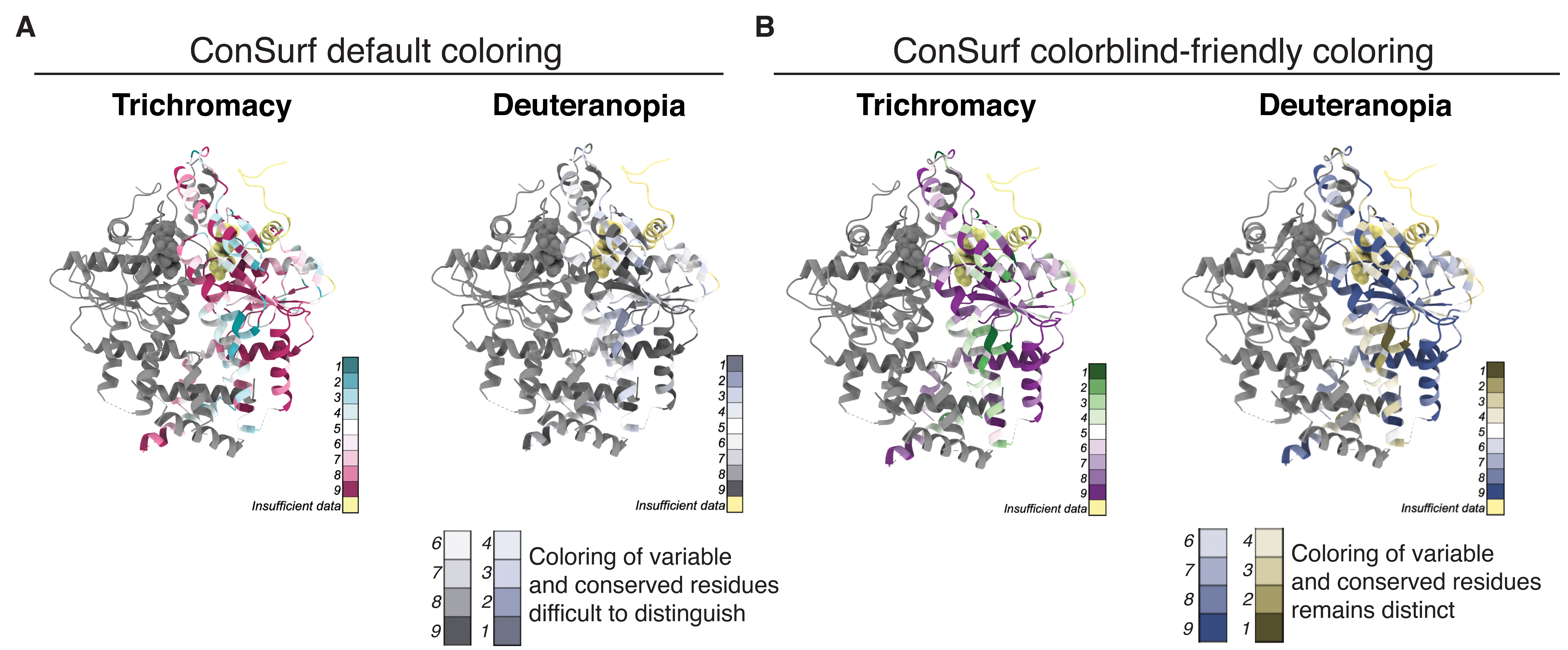
While linear perceptually uniform colormaps are useful for displaying many features of protein structures, users may also want divergent colormaps to display information such as residue conservation. Consurf, a server that creates and maps residue conservation scores onto a given protein’s structure, provides a colorblind-friendly divergent color map option. However, the default yellow color used for residues with insufficient data (I.D.) is indistinguishable from residues assigned a conservation value of 4 for those with deuteranopia (Figure 8.4A). One might instead use the “Coolwarm” colormap, which is both perceptually uniform and divergent, maintaining the distinction between “more variable” and “more conserved” residues as presented by Consurf. Viridis may still be used to show a continuum of evolutionary variability across residues from variable to conserved (Figure 8.4B). In each case, residues with insufficient data are assigned dark grey to avoid perceptual overlap with ranked residues.

While the strategies suggested here will facilitate greatly improved figures, some limitations remain. Typically, effects like fog and shadows are added to provide 3D perspective but result in unintended lightness variation across the colormap. Although this deviation is minimal when using perceptually uniform colormaps future work might consider how to explicitly maintain perceptual differences in color by taking these shading effects into account. Adapting figures so that color is accurately interpreted and accessible is not unique to structural biology. While structural biology is arguably one of the more visual fields, being careful about colors is important across all scientific and engineering disciplines. In all cases, it is quick and easy to either check colormaps for perceptual uniformity (Rogowitz and Kalvin, 2001) or figures for color blindness accessibility (e.g., Color Oracle, Colorblindly). For programs where a non-ideal palette is the default, users can implement patches, ask for direction on changing settings, or request developers rethink previous design decisions (Franklin, 2013; Sjores, 2020). This can be done by switching to a more optimal preset that would follow the lead of widely used scientific software suites such as MATLAB and matplotlib (Droettboom, 2016; Eddins, 2014). For developers who prefer not to use preset color palettes, color transformation utilities are implemented in a variety of languages (Table 8.1).
| Language | Package | License | URL |
|---|---|---|---|
| Python | colorspacious | MIT | https://pypi.org/project/colorspacious/ |
| Python | Color-science | BSD 3-Clause | https://www.color-science.org |
| C++ | ColorSpace | MIT | https://github.com/berendeanicolae/ColorSpace |
| Javascript | color-space | Unlicense | https://github.com/colorjs/color-space |
| R | Colorspace | BSD 3-Clause | https://cran.r-project.org/web/packages/colorspace/index.html |
| Fortran | colors.f90 | LGPL | https://people.sc.fsu.edu/~jburkardt/f_src/colors/colors.f90 |
| C, Matlab, Octave | Colorspace Transforms | BSD 2-Clause | https://www.mathworks.com/matlabcentral/mlc-downloads/downloads/submissions/28790/versions/5/previews/colorspace/colorspace.html |
| .NET | Colorful | MIT | https://github.com/tompazourek/colorful |
| Julia | Colors.jl | MIT | https://github.com/JuliaGraphics/Colors.jl |
We, structural biologists, are molecular cartographers. Just as mapmakers would scrutinize each of their lines, symbols, and colors, it is incumbent upon us to represent illustrations of molecules both accessibly and faithfully to the underlying data. May these improved practices guide us towards more accurate understanding of our world.
8.4 Methods
8.4.1 Perceptual difference calculation
While there are numerous approaches to assess colormap uniformity and accessibility (Kovesi, 2015), here we have plotted the perceptual difference between each successive color within a colormap, which is the approach used by Smith and van der Walt, 2015. Colormaps are sourced from matplotlib as a series of 256 sRGB colors. In short, each color was converted from sRGB to the uniform colorspace CIECAM02-UCS through sRGB1-linear and XYZ100. \(\Delta\)E is then the Euclidian difference between pairs of color coordinates in CIECAM02-UCS. Perceptual differences under alternative modes of color vision were calculated by first finding the set of sRGB values that reproduce how each color of a colormap is perceived under the alternative mode and following the above outlined process (Machado et al., 2009). All color space transformations were done through colorspacious (Smith et al., 2018). For further detail, see the included Jupyter notebook used to create Figure 8.1A,B and Figure 8.2C.
8.4.2 Structure visualizations
Atomic coordinates and/or electron density maps were downloaded from the RCSB Protein Data Bank or the EMDB (SecY, PDB 1RH5; nitrogenase MoFe protein, PDB 3U7Q; Get3, PDB 7SQ0; Get3, EMDB-25373). SecY was colored by B-factor using the default settings in PyMOL (spectrum b).
The coordinates of the nitrogenase MoFe protein contain two alternate conformations for the P-cluster. The atomic coordinates of one of the conformations of the cluster was deleted (molecule CLF in chain A) and the remaining conformation (molecule 1CL) was set to full occupancy and refined using REFMAC5 (Kovalevskiy et al., 2018). The refined density maps were converted to ccp4 maps using FFT within CCP4 (Ten Eyck, 1973; Winn et al., 2011).
Snapshots were generated using PyMOL v2.3.4 (Schrödinger, Inc., New York, NY) and rendered under deuteranopia using Color Oracle (Jenny, 2020) or colorspacious (Smith et al., 2018).
The Get3 local resolution map was created using the Local Resolution Map tool in Phenix (v. 1.20.1-4487-000, (Liebschner et al., 2019)). Figures were made in UCSF ChimeraX (v. 1.6, (Pettersen et al., 2021) ) using the Surface Color menu and the command color sample #2.1 map #1 palette viridis key true. The Viridis, Jet and Coolwarm palettes were enabled through the patch described below.
The Get3 conservation map was generated in Consurf (Yariv et al., 2023) and colored using the colormap patch described below, modified to include RGB codes for the Coolwarm palette (available through matplotlib). Models were colored in ChimeraX with the command color bfactor #1 palette viridis key true range 9,1. Regions that had not been assigned a Consurf value between 1 and 9 were identified in the PDB file and colored grey. The color key was created by modifying the automatically generated key to include only the colors associated with whole-integer values (1-9) and grey.
8.4.3 Software availability
Patches to make Viridis and accompanying colormaps easily accessible in PyMOL, ChimeraX, and VMD can be found here: https://github.com/smsaladi/pymol_viridis, https://github.com/smsaladi/chimerax_viridis, https://github.com/smsaladi/vmd_viridis.
With new colormaps and an increased focus on accessibility, we also suggest being explicit about scale. Scalebars, which are seldom used, will help interpretability for non-experts, which is especially critical considering our highly stylized representations of biological macromolecules (Richardson, 2000), the fact that ever-larger macromolecular complexes are being solved, and the quantitative nature of the data being presented, such as for tomographic densities. A guide for creating a scalebar across various visualization programs can be found here: https://github.com/smsaladi/structure_scales. All code is made available under the open-source MIT License.
8.5 Acknowledgements
We thank members of the Clemons and Rees labs for discussion and S. Petrovic for comments on the manuscript. This work was supported by the National Institutes of Health (NIH) grants GM105385 and GM097572 (to WMC) and a National Science Foundation Graduate Research fellowship Grant 1144469 (to SMS).
