6 Don’t be stuck with rainbow: Fixthejet
Alex Guerra, Shyam Saladi
6.1 Abstract
Data visualization is a key part of scientific studies—often the result of many painstaking hours of experimental setup and collection is the final rendering of analyzed data into a figure for publication. While seemingly simple and innocuous, the carefree conversion of numerical arrays to visible colors can unintentionally introduce drastic visual artifacts. These artifacts are a produced by the colormap, i.e., that mapping function, employed and stem from the multifaced way in which humans perceive color and differences therein. Here, we present a web-based tool to rerender these figures with modern, perceptually-uniform, colorblind-friendly colormaps.
Keywords: data visualization, perception, perceptual uniformity, colormap
6.2 Introduction
Data visualization plays an indispensable role in scientific research. Often, after rigorous hours of experimental design and data collection, the final task is to convert this complex data into an illustrative figure for publication. However, the seemingly straightforward process of converting numerical data into visual colors can inadvertently introduce significant visual distortions. These distortions arise primarily from the chosen colormap—the mapping function translating numbers to colors—and are intricately linked to the complex ways humans discern and differentiate colors.
Human cognition is uniquely structured, allowing us to process different types of information with varying efficiency. While our capacity to swiftly comprehend and interpret raw numerical arrays is limited, our visual system is exceptionally adept at deciphering visual stimuli. This ability allows us to quickly detect subtle differences in color and discern patterns, making complex data sets more comprehensible when represented visually. However, the transformation of numerical data to a visual representation hinges on the colormap used for the transofmration. An inaccurate or non-intuitive colormap can distort data interpretation, leading to misconceptions or missed insights. It’s not simply a design choice but one that can ensure or erase data integrity and clarity.
Computer-based conversion of numerical values to colors was pioneered in the early 1980s with the advent of color raster graphics by Karl-Heinz Winkler. Utilizing a technique named “MUNACOLOR” in homage to its origins at the Max Planck Institute of Astrophysics in Munich, West Germany. MUNACOLOR used a piecewise linear function associate fractional numbers between 0 and 1 with specific degrees of red, green, and blue (Winkler and Norman, 1986), the fractional number transformed into a degree of Red, Green, and Blue via an equation. It was designed for computational efficiency given computers of the day. While a simple mapping in retrospect, it covered the visible spectrum of colors. Today, this method, popularly known as a “rainbow” colormap or “Jet” (a nod to its initial use in fluid dynamics visualizations involving jets), remains a commonplace in scientific data visualization across numerous disciplines.
While the original goal of the rainbow colormap was to create a more intuitive, human-readable representation of numerical data, it has been shown to fall somewhat short of this goal (Borland and Taylor, 2007). Specifically, smooth numerical data can appear as having abrupt transitions due to the rainbow colormap’s convoluted and perceptually non-uniform luminance profile. Decades of research into color perception and recently renewed interest in perceptual uniformity have led to the creation of improved colormaps: “viridis,” “parula,” “magma,” “inferno,” “plasma,” and “cividis.” These new colormaps not only maintain perceptual uniformity but also account for prevalent colorblindness disorders, such as red-green colorblindness (deuteranopia). Examples of such superior colormaps include
Despite their availability and open licensing, uptake of these new colormaps has been hampered by a variety of issues. Firstly, there is a large amount of disparately maintained software across scientific fields, so there are simply a large number of domain-experts who need to be made aware of the problems with rainbow colormaps and the availability of alternatives. Furthermore, existing literature is replete with figures using poor rainbow colormaps, that in many fields are the standard, accepted visualiations. A case to practioners across these fields needs to be made to advocate for the use of new, perceptually uniform colormaps. Here, we attempt to address the issue of previously made figures using rainbow and other poor colormaps by providing a web-based tool to convert these figures to a perceptually-uniform, colorblind-friendly colormap. In the process, we hope that domain-experts will be able to compare the original and converted figures side-by-side and, perhaps, identify the benefits of using a perceptually-uniform colormaps and then advocate for changes within software in their fields.
6.3 Perceptual issues with the Jet colormap
The Jet (rainbow) colormap, despite its widespread usage, has been a subject of critique both in scholarly articles and digital forums. For the sake of context and understanding, we’ll delve into the primary issue with the rainbow colormap: its lack of perceptual uniformity.
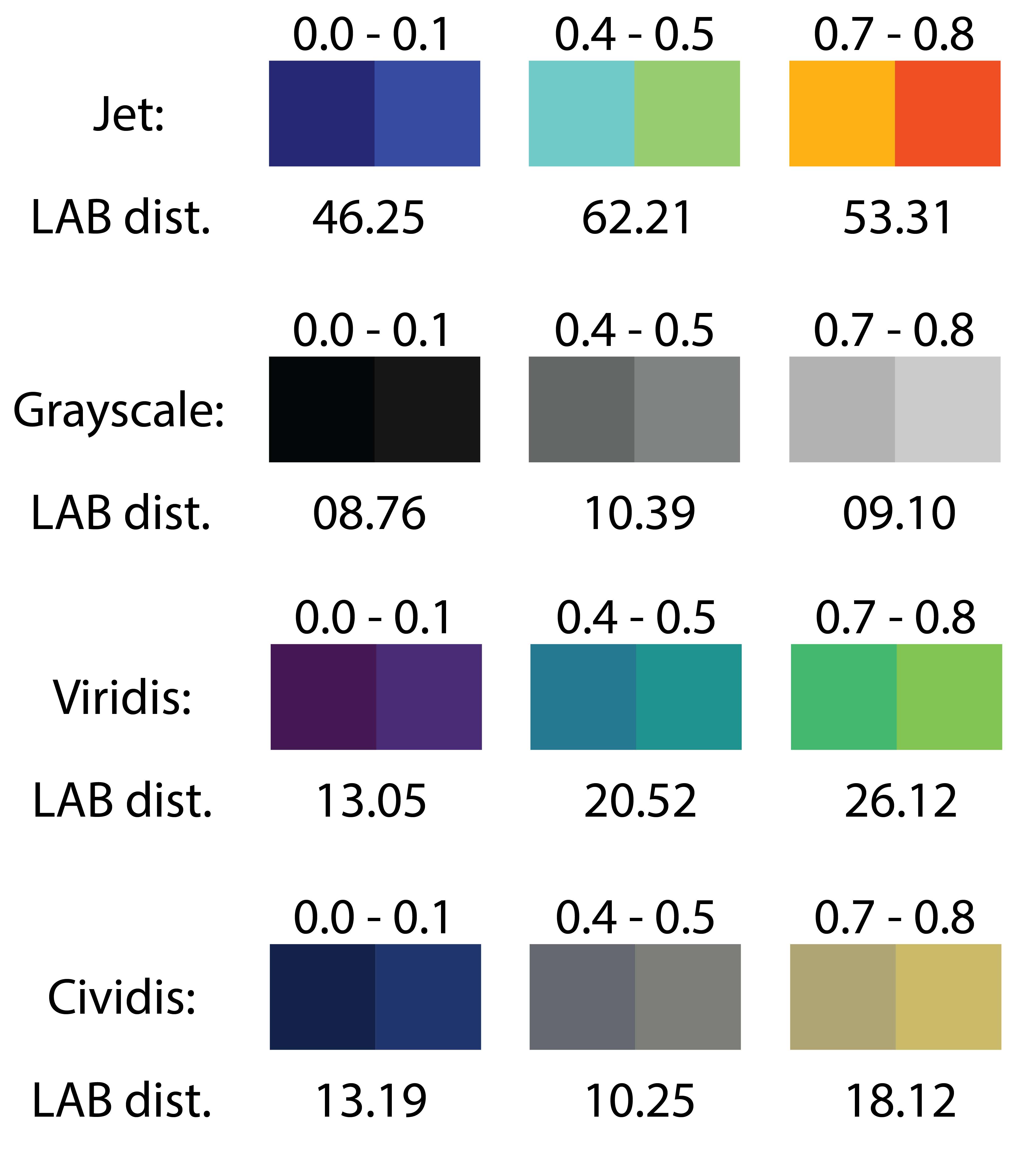
One way to understand the lack of perceptual uniformity is to select pairs of numbers that are a fixed distance apart, convert each of these numbers to colors using the rainbow colormap, and then compare the resulting perceptual difference between each pair. Given the fixed numerical increment, ideally we expect the percieved difference between each pair of colors to be identical Figure 6.1.

6.4 Method
6.4.1 Conversion algorithm
Given the significant amount of existing literature and figures using the rainbow colormap, we sought to create a tool that would allow users to convert these figures to a perceptually-uniform colormap. Viridis is set as by default since it has taken significant hold in the Python library matplotlib and related data science communities, but we allow the user to select from a series of perceptually uniform colormaps.
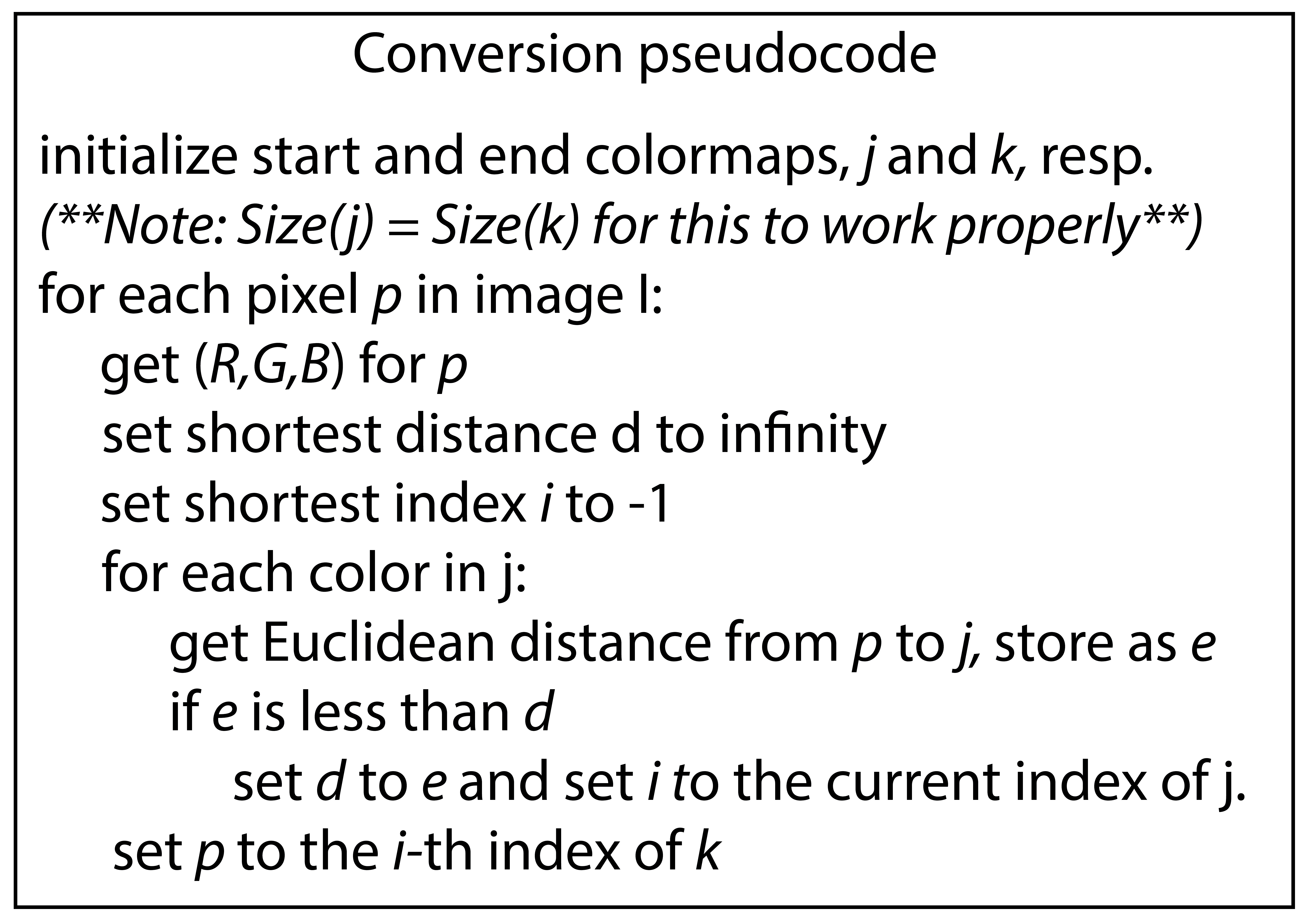
The mapping of numbers to colors with a colormap necessarily uses a one-to-one relation. So, our approach identifies the color as a RGB primary associated with each pixel in an image provided, finds the closest match in a rainbow colormap by Euclidian distance in RGB space, and uses the matching color’s position in the colormap to infers the underlying fractional numeric value. With this fractional value and a new colormap, we can select a new color to convert the original pixel to. This process is repeated for each pixel in the image, resulting in a new image with the same dimensions but a new colormap. See pseudocodein Figure 6.2.

This approach works fairly well despite potential concerns. First, the original image may have been compressed or rasterized, so the color of each pixel may not correspond to the color of the underlying graphical element. Despite this concern, we were suprised to find that our method worked just fine over a wide variety of examples. Second, the original image may have been rendered with supplementary items like gridlines, legends, and text and in colors not present in the colormap (e.g., white, black are not in the jet colormap). These are also intuitively dealt with by simply excluding them from the conversion process, i.e., kept the same. We experimented with using different distance approaches, instead of Euclidian distance in RGB space, like distances after converting the color to percetually-uniform color space (e.g., CIELAB, CIELUV, CIELCH), but we found that the Euclidian distance in RGB space worked best.
6.4.2 Implementation and Availability
The tool is implemented in standard javascript to be web-based and completely operates on the user’s browser. It takes in a jpg, tiff, or other raster graphic, calculates the transformation for each pixel, and then displays both the original as well as the transformed image. This allows the users could easily compare the original and converted figures with old and new colormap side-by-side. It can be found at <fixthejet.caltech.edu> with source code under version control at <github.com/smsaladi/fixthejet>.
6.5 Results
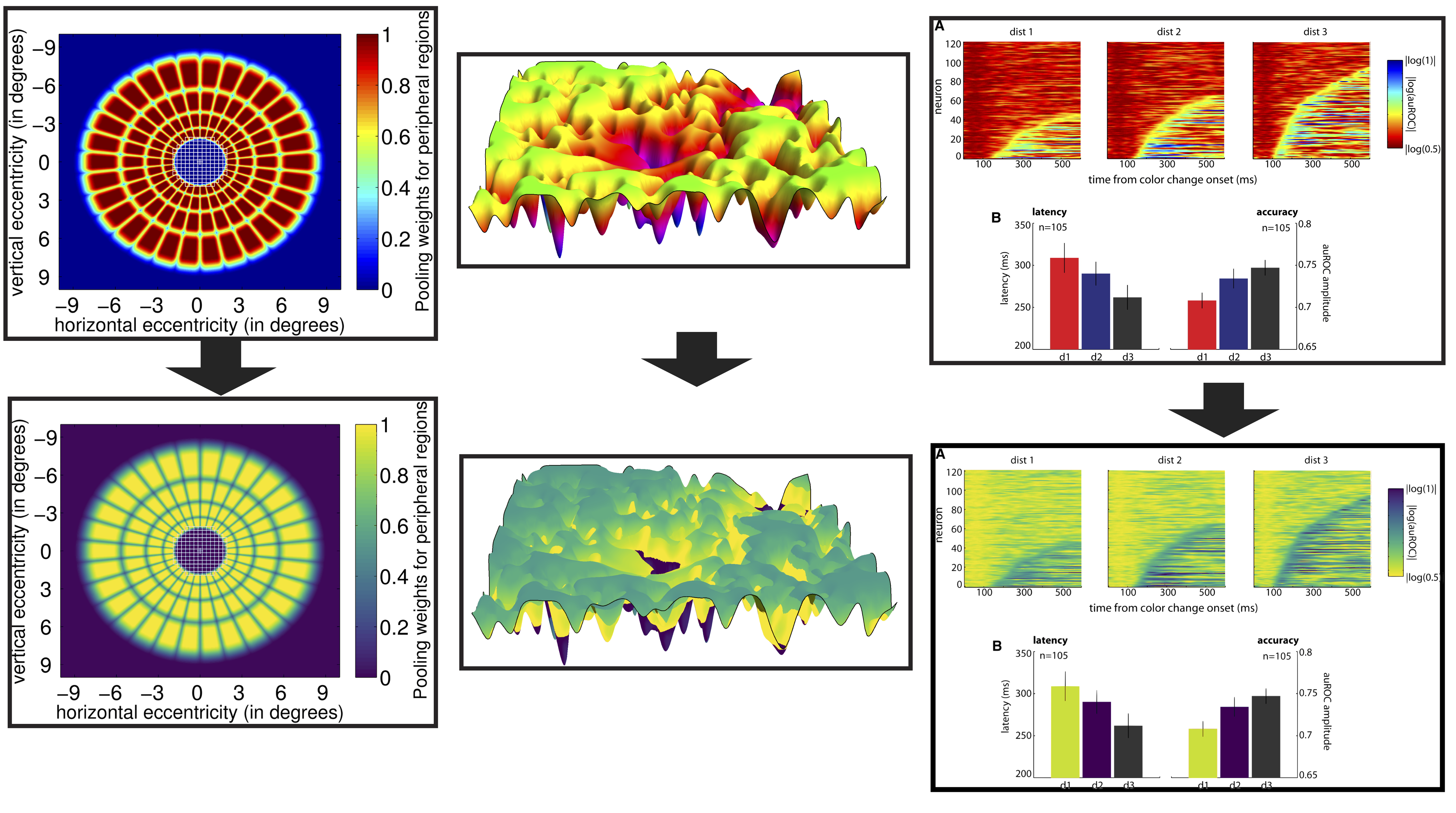
To ensure the robustness and versatility of our tool, we subjected it to extensive testing using a variety of images from published scientific journals. The primary aim was to ascertain how the software interacts with different types of figures commonly found in scientific papers. Through these tests, we discerned not only the tool’s capabilities and limitations but also the nuanced data elements that were previously obscured due to the original rainbow colormap. A vivid demonstration of these findings can be observed in Figure Figure 6.3.

Despite the conversion method’s simple algorithm and its uninformed approach to image intricacies, the outcomes appear remarkably effective. A future approach could leverage richer datasets, factor in diverse rasterization resolutions, and employ context-aware pixel back-mapping. For example, this approach does not appreciate the underlying structure of the pixel data within the image and knows nothing about image compression or other issues arising from rasterization. It is suprising how well it works. Going forward an improved approach might learn from data by generating a large sets of sample data, rasterizing each image at various resolutions, and then adjusting each pixel’s back-mapping adjusted by its environment.
By making this method available as a web-based tool, we encourage the scientific community to tinker with their domain-specific images, hoping this platform becomes a confluence for collaborative discussions. With tools like these open for exploration and feedback, the endeavor to enhance clarity in data visualization gets a collective push. Our aspiration is that this initiative acts as a catalyst for more comprehensible visual data representations in the scientific realm.
